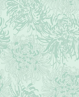
So after LOTS and LOTS of months of procrastination, I decided to finally pull the trigger and make the order. After getting a rather large quote from the original store I saw the pattern, I decided to search out some online options. I ended up finding a fabulous deal from a Californian online wallpaper shop - well, what started off as a fabulous deal...
(This is where I learned the #1 lesson of ordering online. Don't let UPS deliver you a package originating in the States. EVER. You will get charged a $40 customs broker fee + whatever ridonkulous taxes/charges may be levied. So yeah - here's your free lesson - ALWAYS ask what the shipping method will be and if they say UPS run very far away from that transaction.)
Anyhoo - so the UPS charges aside, I still sort of came out on top from a cost perspective...
Until I opened the package. And realized they had sent me the wrong wallpaper.
Crumbs!
So onto the phone - I filed my complaint and tried to determine how they were going to fix this - I wasn't paying for more non-refundable shipping etc etc etc. Turns out while the order fulfillment error was clearly on their end, the pattern I had ordered was no longer being made and couldn't be shipped. (And yes this infuriated me, and trust me you don't want to hear how that conversation went - but I have accepted it now and we need to move on people. MOVING. ON.)
So I've perused their site a lot - and picked a few options - but really can't decide because I don't love any of them as much as my original choice... so here's where you come in! I want opinions!
Here's the original design that I had ordered (because I have a thing for blue recently) (clearly, as Katie's room proved) (and also worked really well with white beadboard/trim + choc brown accents - because those design plans aren't gonna be changing)...
This is the original - a duck egg blue background that was slightly irridescent and absolutely lovely in person. *Sigh* Yes, I'm still a little bitter it's not available...
So here's the options - please weigh in on which # you'd choose as a replacement...
1. Replace with same design, but different background colour.
It comes in a few colourway options - but I think yellow is the only other that even slightly appeals to me.
2. Keeping blue + flower theme - still very graphical with a slight nod to vintage.
3. More blue, more flower, more vintage-feel with a shimmery detail.
4. Different flowers, more organic design. Heavier on the brown accents.
5. No blue at all - but eco friendly paper!
6. More vintage - these are called "field poppies" - awww!
7. Keeping with the blue - but instead a damask pattern...
8. Bolder, more graphical - but not sure how it would translate with brown accents.
9. Much more modern - another "shimmery" style paper.
10. A bit more understated, but would pair well with beadboard + brown accents.
I look forward to all y'all's perspective here. You know sometimes how you look at something so much you can't distinguish which you'd prefer anymore at all? That's where I'm at. I look and look and look, and think I have a preference. Then look again and think, nope - I HATE that one.
So please, weigh in. With an opinion or without - just give me a vote...
Kisses!
xxoo.S


2 comments:
First choice is 8, then 6. I also like 4.
Good luck choosing.
I like 6,,,,,then 4 nice patterns
Post a Comment